In order to contribute to answer this question, we have chosen to study facts in recent history, i.e. the replacement of Pound Sterling by US dollar during the XXth century. It is difficult to find accurate information about how this change occurred. Central Banks' archives are not available to the general public. But a recent work by Schenk[1] shed new light on this question.
We will introduce relevant data aggregates coming from IMF to figure out the current status and the dire anticipated future for the US dollar.
From a reserve currency to a dominant currency
First, Schenk has pointed to the need to distinguish the reference currency used for the usual international trade from the dominant currency in central banks reserves. The currency used for the international trade is a simple political choice, based on the known currency stability at this time. US dollar was chosen in Bretton Woods, 1944.
Second, the choice of world trade reference currency has only little link with the current dominant currency in central banks reserves. Read the sentence on page 4, Ref[1]: "...the dominant reserve currency shifted from sterling to the USD and back again during the inter-war period." [2]
Technically, this currency used for the international trade can be replaced in a few months with the current computing systems. After the decision is taken at an international level, we only need to modify the currency used in some few key markets including oil, commodities, gold.
The replacement of Sterling by the US dollar has occured when the US$ was less than 30% of central banks reserves. This replacement has driven a huge deflationary pressure onto the Sterling, at this time the dominant reserve currency. This is the reason why a strategic partnership was introduced between US and UK. But also, multiple monetary cooperations have been deployed by the main central banks to avoid a rapid collapse of Sterling. This transition occurred during several tens of years (see graphic below) when we saw the Sterling depreciate slowly step by step, like if we release steam pressure. If this transition has taken so long, we can be sure it was the only way to protect UK banking system (and its owners), who agreed, in return, to change UK policy into a strong ally of US on every future subjects.
We can draw several conclusions from this historical comparison relevant for our times :
-
First, the second dominant reserve currency deserves a deep attention (see next part below). This currency does not need to become the first dominant reserve currency before becoming the world reference currency
-
Second, as soon as the world trade reference currency has officially changed, an enormous force is liberated leading to the devaluing of the previous reference currency, because it is less used hence less needed into central banks reserves. A lot of people then want to sell a lot of this currency. We can even precise that the speed of devaluing is not in the hands of its emitting country. It is fully in the hands of others central banks who own large assets in this currency. They must negotiate successfully in order to avoid a brutal currency collapse. This deal must be executed during tens of years to release the deflationary pressure step by step, using small devaluings. In our times, the big owners of US dollar reserves, apart Fed, are China, Japan, Gulf Countries, and some countries in Europe. How much of them are nowadays really willing to avoid the US dollar collapse at any price, and have the economy in good health to support this transition's weight during so long ?
-
Third, UK situation up to 1945 was very different than the US current situation, see sovereign debt and unemployment ratio, public services and industrial investments, military infrastructure to sustain. International relations were fully different : UN, IMF were created at this time, and currently UN, G20 and IMF have not succeeded in enforcing any real solution about the global systemic crisis and about the monetary disequilibrium. That's why monetary strategies used for decades to move from Sterling to US dollar and support Sterling with a long transition period cannot be used today.
The dollar, Euro and Unallocated reserves in central banks
We made some simple calculations based on last available IMF COFER data[3], to figure out the different currencies total reserves. Here we want to compare data available for all countries together, for advanced economies, for emerging and developing economies, for USA alone, and for Hong-Kong chinese special administrative region.
1) Composition and growth of official reserve assets (or total foreign exchange holdings) between 1999 and 2011

(clic to zoom)
The main facts to notice are :
-
Total foreign exchange holdings have increased much more from 2001 to 2007 than from 2007 to 2011 in any countries groups
-
This growth is always much bigger in Emerging and developing economies than in Advanced economies
-
Hong Kong and USA have fully different growth patterns compared to any countries groups : a weaker growth between 2001 and 2007, and a much stronger between 2007 and 2011 (see yellow cells)
-
The Unallocated reserves[4] are quickly becoming the dominant share of official reserve assets in the world, including China
They counted for 22% of world total foreign exchange holdings in 2001, 37% in 2007, 45% in Q4 2010. Growth of the Unallocated reserves is much stronger than growth of allocated reserves anywhere between 2001 and 2011 (see blue cells). Once again, this trend is much bigger in Emerging and developing economies. They own now 91% of all unallocated reserves in the world, when advanced economies own only 9% (see rows : "% unallocated in the world" ).
-
The Emerging and developing economies owns 2 third of the world total foreign exchange holdings. From 38% of the total in 2001, this share climbs to 59% in 2007 and 67% in 2011.
-
The Fed owns a tiny and a shrinking share of world total reserve assets
From 4.1% in 2000, this share has shrunk to 1.2% in 2007. Even with the massive QE program and Treasuries purchases by the Fed since 2008, this share is currently still only 1.5%. They are half of Hong-Kong's reserves since 2001 (see violet cells).
2) Composition and growth of allocated reserves in Euro, dollar and SDR currencies between 1999 and 2011

(clic to zoom)
Knowing that allocated reserves represent only 55% of world total reserves assets in Q4 2010, the main facts to notice are :
-
Growth for world claims in US dollar is significantly lower than growth for world claims in euros, and continously since 2001. It is even lower than growth for claims in SDR[5] basket currencies in the same period. This trend is observed for advanced economies as well for the Emerging and developing economies (see green cells).
-
If world claims in dollar represent currently 61% (respectively 26% for Euros) of world total allocated reserves, they represent only 34% of world total foreign exchange holdings (respectively 15% for Euros). This means that the exact composition of currencies into the Unallocated Reserves have a decisive weight to determine the really dominant currency in world reserves (see rose cells). Said differently, it could be possible that today already the dominant currency in reserves would actually be Euro. At least, we can only say that dollar is currently only the supposed dominant currency in world reserves.
-
The share of claims in Euro in allocated reserves is similar in advanced economies and in Emerging economies, and same for claims in dollar. (see rows "euros / total allocated reserves" )
-
The difference between claims in dollar and claims in Euros is lower in Emerging economies (64 - 25%) than in Advanced economies (58 – 28%). Said differently, the Emerging economies are willing to report the claims in Euros (instead in dollar) more often than the Advanced economies.
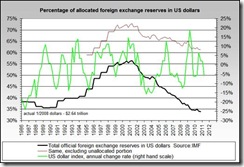
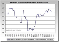
These graphs[6] summarize the situation of the claims in Euros and dollar (clic to zoom) :
And the following graph summarizes the question around the currently dominant reserve currency. It is relevant because of the dominant share of Emerging economies in the world reserves :
(clic to zoom)
Let's have a look now on claims in SDR basket currencies. These shares allow us to compare a little more precisely between US and Hong-Kong reserves, because they report the claims in SDR basket currencies but not in dollar or in euros.
It is important to note that "The initial weights assigned to each currency in the SDR basket have been adjusted to take account of changes in the share of each currency in world exports of goods and services and international reserves."[7] In this respect, Euro share is 37.4% and dollar share is 41.9%.

(clic to zoom)
Knowing that allocated reserves represent only 55% of world total reserves assets in Q4 2010, the main facts to notice are :
-
The share of Yen and Sterling in reserves is tiny in any group of countries.[8] This means that trends observed using claims in Euro and dollar are still valid.
-
The Hong-Kong's central bank has started to diversify in others currencies since 2007 (it could be asian neighbors currencies, Ruble, Real…). This share currently remains small.
-
The Fed does not claim any asset in Canadian Dollar, or Mexican Peso.
-
The Fed's share of claims in SDR basket currencies in the world represent nearly half of Hong-Kong's one.
-
The growth of claims in SDR basket currencies has suddenly increased (108%) between 2007 and 2011 in US, more than in any group of countries, and even more than Hong-Kong.
People are running faster than bankers
UN and IMF has already published papers about the unavoidable move from US dollar as the world trade reference currency in the following years. Since years, the question is not about IF, but about HOW and WHEN.
From our article's perspective, we can say that the transition period for the US dollar will be fully different compared to the Sterling's one.[9a]
Currently most central banks have only one ideology : how to sustain US dollar reference currency 20 years more, to mitigate their own risks and allow a managed transition towards a (still to be internationally decided) next reference currency or basket of currencies ?
The problem is that the social situation in most countries is so bad[9] that people will never give the time to this 20 years long strategy to maturate and be executed. More and more people in the world become conscious that central banks' interests are opposite to theirs. This will also influence many central banks to not support the strategy decided by the currently leading central banks so far (US and UK).
This is the main reason why a managed transition to replace US dollar will not take place, and therefore why US dollar will collapse.
The question of WHEN this will take place has already been discussed by LEAP[10] ,
Lee Adler (see also interview
part 2 on ZeroHedge) ,
Edwin Vieira and
others. The collapse is a process which will take some months to complete, not a single day. It could start as early as in next coming months, or next few years depending on extraordinary monetary decisions (QE3 or similar massive bond purchases, first limited dollar devaluation, tentative short period of hyperinflation...), public results of audit of the Fed or US gold reserves, or massive social unrest in the US.
[2] followed by a reference : B. Eichengreen and M. Flandreau, ‘The rise and fall of the dollar, or when did the dollar replace sterling as the leading international currency?’, NBER Working Paper 14154, 2008.
[3]
IMF, March 2011 ; At the present, 33 advanced economies and 105 emerging or developing economies report most of their allocations to COFER. Because COFER full data for China mainland are not available, we choose to compare also with
Hong-Kong chinese special administrative region data. The "All IMF reporting countries" rows include China mainland figures.
[4] Unallocated reserves represent the total reserves of non reporting countries to COFER, and any discrepancy between countries’ data on total reserves as reported to COFER and to IFS. This covers more than 180 countries.
[5] The SDR was redefined as a basket of currencies, today consisting of the euro, Japanese yen, pound sterling, and U.S. dollar. In the tables, "claims in SDR basket currencies" means the sum of the claims in dollar, euro, Yen, Sterling.
[10] "
Last warning before the Autumn 2011 shock, when $15 trillion of financial assets go up in smoke” G.E.A.B number 56, Laboratoire Européen d’Anticipation Politique, june 2011.
Update 18th of July 2011 :
This article has already been read by many persons from 46 countries !
Here is a summary of the main readers location :
(clic to enlarge)
Update 20th, 22nd, 25th of July :
added new countries and significant towns : Bangkok (Thailand), New Delhi (India), Warsaw (Poland), Tunis (Tunisia), Hanoi (Vietnam), Geneva (Switzerland),
Ljubljana (Slovenia) for a total of 51 different countries ; 31 states and 114 different towns in the United States.
Update 21st of August :
new total of 55 different countries.
Update 07/26/2013 :
updated data can be found on these pages :


